Reporting & Analytics
Pointless MCP can pull and compare your sales data on request — hour-by-hour trends, day/week/month breakdowns, department and category sales, employee rankings, and financial summaries — without you building a custom report first. Ask for what you want to see and MCP puts it together, usually as a table you can act on right away.
What You Can Ask For
Hourly and trend comparisons
- "Compare the last 4 Sundays hour-by-hour and put them in a table — highlight which hours are trending up or down week over week."
- "Show me sales by hour for yesterday vs. the same day last week. Where did we lose money?"
- "Compare this Z-run's hourly sales to the store's typical Saturday pattern — did we peak earlier or later than usual?"
- "What's our slowest hour on average across the last 4 Fridays? I'm deciding whether to cut a shift."
- "Combine hourly sales across all my sites for the last 3 Sundays and show me the total by hour, broken out per site."
Day, week, and month breakdowns
- "Break down this month by day and tell me our 3 best and 3 worst days — any pattern (weekday vs weekend)?"
- "Group last 90 days by month and show the trend — are we growing or flat?"
Sales by department, category, or item
- Ask MCP to group sales by department, category, subcategory, product, brand, or item type for any date range or Z-run — useful for spotting which part of the menu is carrying (or dragging) a shift.
Employee performance
- "Rank employees by total sales for the last 2 weeks, side by side."
Financial summaries
- Ask for gross, net, and non-taxable sales, plus labor hours and pay, for a date range or a single Z-run — the same figures shown on the register's Financials card.
Example: Hourly Trend Comparison
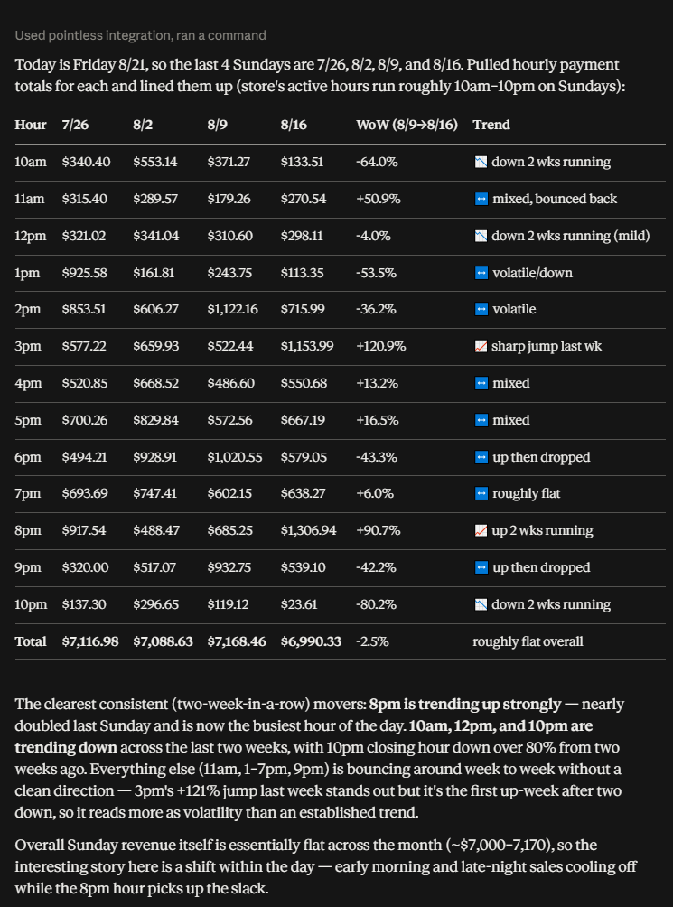
Given a prompt like "compare the last 4 Sundays hour-by-hour," MCP lines up the hourly totals side by side, calculates the week-over-week change for the most recent pair of weeks, and calls out which hours have moved in the same direction for two weeks running versus which are just bouncing around.
Example: Combined Hourly Sales Across Multiple Sites
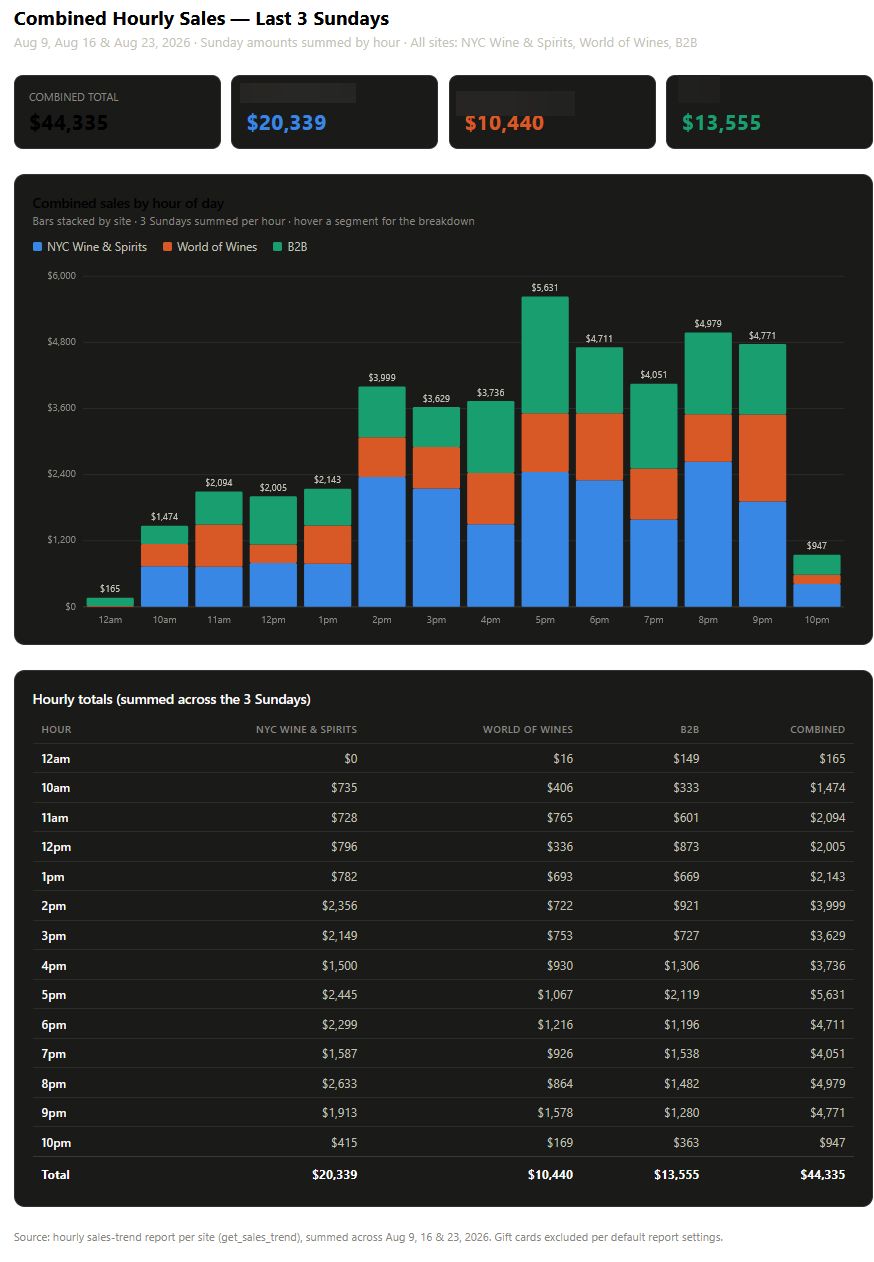
If you run more than one site, MCP can combine them into a single view — for example, "sum hourly sales for the last 3 Sundays across all my sites" returns one chart and table with each site's contribution broken out per hour, plus a combined total. This is the same hourly grouping as above, just rolled up across locations instead of run separately for each one.
Example: Single-Site Hourly Trend, Written Up
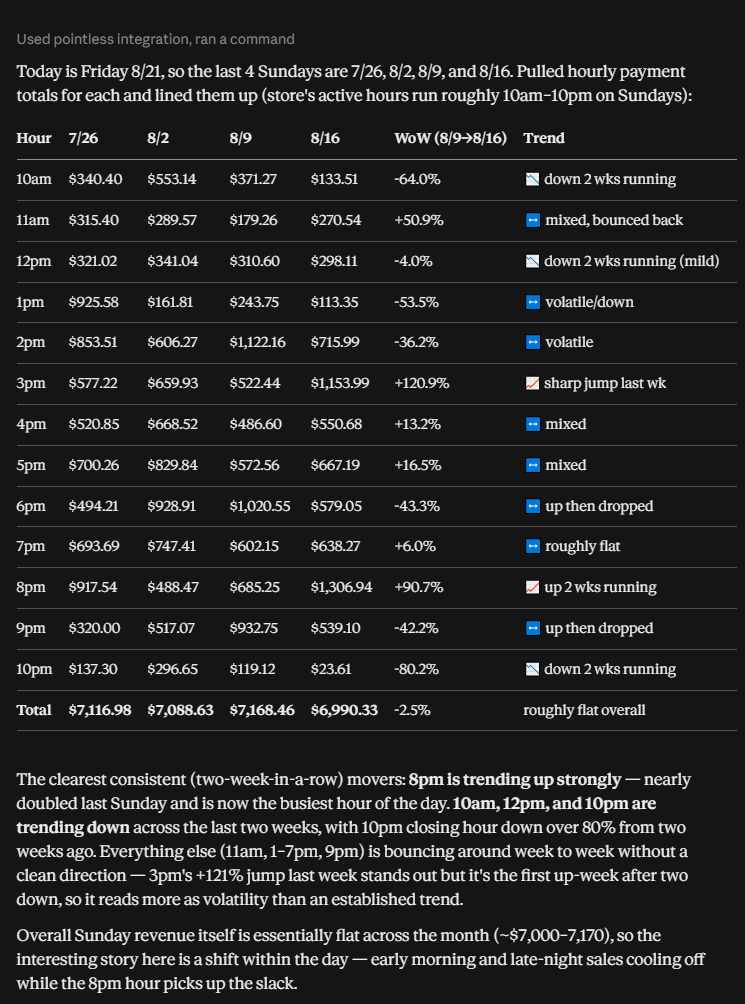
MCP doesn't just return numbers — ask it to call out the story in the data ("which hours are trending up or down two weeks running, and which are just noise?") and it'll narrate the table: consistent movers, volatility, and an overall read on the period, the way a manager reviewing the numbers would.
What You Can Do With These Reports
Once MCP hands back a report, it's a normal Claude conversation from there — the data doesn't have to stay in a table:
- Ask follow-up questions in plain language — "why did 8pm spike two weeks running?", "does that hour have enough staff scheduled?", "show me the same comparison but by department instead of total sales."
- Have Claude turn it into something else — a written summary for a manager meeting, a chart, a one-page recap for ownership, or a slide.
- Feed it into planning decisions — compare against labor hours to spot over/understaffed hours, or against a promotion window to see if it moved the needle.
- Move the numbers into accounting or bookkeeping tools — for sites using the QuickBooks Online Integration, daily Z-run totals already post automatically; MCP's reports are for ad hoc analysis on top of that (comparisons, trends, exceptions) rather than a second posting path. If you use a different accounting or spreadsheet tool with its own Claude-compatible connector (its own MCP or a supported import format), the same report data can be handed off there for reconciliation or recordkeeping.
- Export or hand off the table — copy the results into a spreadsheet, doc, or email for anyone who doesn't need the full MCP conversation, just the numbers.
How It Works
- Describe the comparison or breakdown you want — the time period(s), how to group it (by hour, day, month, department, category, item, or employee), and anything you're trying to decide (e.g., "should I cut a shift").
- MCP pulls the underlying sales, item, and labor data for that window and groups it the way you asked.
- Results come back as a table, with trends, best/worst callouts, or comparisons highlighted based on what you asked for.
- Ask follow-up questions against the same data — narrow the date range, switch the grouping, or ask MCP to explain a specific swing — without starting over.
Notes
- Reports can be scoped to a date range or to a single Z-run (register close).
- Sales breakdowns exclude gift card and store credit activity by default, unless you ask to see gift cards specifically.
- Financial summaries reflect pre-tax, pre-discount figures unless you ask otherwise, matching the register UI's Financials card.