Product & Item Catalog & Menus
Products - Prices - Item Types - Taxes
Overview
The product catalog can range from just a few items for some businesses to thousands of items for others. Here are a few examples so we can center ourselves around thinking about what a catalog means to you and how you can relate to the catalog you'll be setting up.
- Self-Frozen Yogurt usually has just a few products they sell, a variety of cups to tare, and some drinks.
- Liquor Stores - Usually we can take CSV file that has many of the items, This means a list of several thousand items can be imported and very little data entry has to occur.
- Cannabis may require you to import your products from an outside system like METRC, and then modify the description of the product, and the chemical values, pictures, meta tags, and more.
- Restaurants - A menu might include happy hours and prompts and sizes. Manual entry is usually required.
- Clothing and Resale - Items might be entered only as customers bring in products. Or in batches when buying at an auction or elsewhere.
Product Catalog
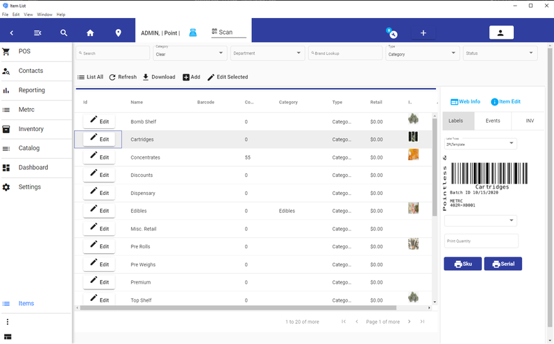
Getting started with the catalog is simply opening it up, and reviewing some of the items. You can see the search options on the top, you can see what happens when you select items. You can perform a sale, and then use another tab in your browser to review the item and its details of it after the sale. Using the sale to see what occurs, and how an item behaves, is a great way to experience the settings of items and what features you might want to copy.
Catalog
Add Edit & Copy
Items are defined by their type. This controls the behavior of the options.
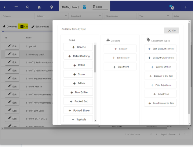
Add Items
Editing & Copying Items
Because there are numerous features about items, the window shows what's pertinent to each type. So if you were expecting certain features on an item you are working on, make sure the item type is set up according to what features you need.
Copying an Item
Copying an item creates a brand-new item — the original is left untouched. The copy's name gets " Copy" appended, and once the copy is saved the editor switches to the new item (a confirmation banner shows the new item's ID). The item's ID is displayed in the editor header so you can tell which item you're working on.
Title Case Product Names
Product names are automatically formatted to title case as you edit them: when you leave the Name, Display Name, Alt Language, or Full Product Name field in the product editor, the first letter of each word is capitalized. Words that are already capitalized, and all-caps words (such as acronyms), are left as they are.
To fix names in bulk, open the Edit Selected Items screen, select the items you want to fix, and click Title Case Product Names. After confirming, the selected items' names are title cased and the update is applied.
Department-Category Mismatch Warning
When editing a product, the Category and Sub Category selectors allow you to pick from all available categories — not just those assigned to the product's Department. If a category or sub-category no longer belongs to the selected Department (for example, after categories are reorganized), a warning banner will appear at the top of the product editor. The warning will indicate whether the Category, Sub Category, or both are mismatched with the selected Department. Changing the Department, Category, or Sub Category will automatically clear the warning once the values align.
Managing Multiple Barcodes
For non-cannabis items, you can assign multiple barcode entries to a single product. Each barcode entry can carry its own SKU, quantity, depletion amount, price, and unit of measure — useful for multi-packs, variant packaging, or supplier-specific barcodes.
Basic Barcode Fields
In the Basics section of the product editor, you'll find two single-value barcode fields:
| Field | Description |
|---|---|
| Barcode | Primary barcode for the product |
| Barcode Alt | Alternate barcode for the product |
Barcode Manager
Below the main grid in the product editor, the Barcode Manager card lets you manage multiple barcode entries for the product.
The Barcode Manager has two modes:
Read-Only View — Displays existing barcode entries in a table showing Barcode, SKU, Qty, Deplete, Price, and UOM. Click Edit to switch to edit mode.
Edit Mode — Allows you to add, modify, or delete barcode entries. Click Save All to persist changes.
Barcode Entry Fields
Each barcode row contains the following fields:
| Field | Description |
|---|---|
| Barcode | The scannable barcode value (required) |
| SKU | Stock-keeping unit identifier for this barcode |
| Qty | Quantity this barcode represents (minimum 1) |
| Deplete By | How much inventory to deduct when this barcode is scanned (minimum 1) |
| Price | Override price when this specific barcode is scanned |
| UOM | Unit of Measure — select from available unit types (e.g., each, case, box) |
Managing Barcode Entries
- Add Barcode — Click the Add Barcode button in edit mode to create a new empty row.
- Delete — Click the delete icon on any row to remove that barcode entry.
- Save All — Saves all barcode changes at once. Changes are also auto-saved as you type.
Availability
The Barcode Manager is only shown for non-cannabis item types. Cannabis items use a separate barcode assignment flow.
Item types are defined when you initially set up the system, and you can go back and change them at any time. They are designed to be added, modified, and deleted as your business needs evolve.
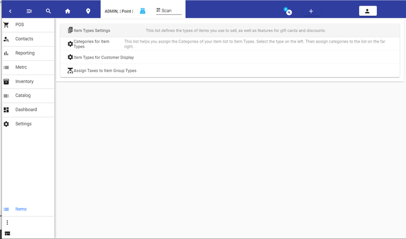
From the three dots on the lower menu, select Item Types to open the Item Types module. The module is organized into four expandable panels.
Item Types Settings
The first panel displays all configured item types in a grid with toolbar actions above.
Toolbar Buttons
| Button | Action |
|---|---|
| Init List | Deletes all item type settings and re-initializes them from the default template. A confirmation dialog will appear. Use this to factory-reset item type configuration. |
| Refresh List | Reloads the current list of item types from the database. |
| Delete Selected | Removes all currently selected item types from the grid. A confirmation dialog will appear before deletion. |
| Add | Creates a new blank item type and opens the Item Type Editor for configuration. |
| Metrc Types (create) | Generates item types automatically from your METRC categories. Available when METRC integration is configured. |
| Metrc Types (filter) | Filters the grid to show only item types that have an associated METRC category ID. |
Enabled Filter Toggle
The Enabled toggle at the bottom of the toolbar filters the grid display. When on, only enabled item types are shown. When off, only disabled item types are shown. This does not change the enabled/disabled state of any item type — it only controls visibility in the grid.
Grid Columns
| Column | Description |
|---|---|
| Edit | Opens the Item Type Editor for the selected type. |
| Name | The display name of the item type. |
| Group | The broader category group (e.g., Retail, Cannabis, Grocery, Tobacco, Discounts). |
| Enabled | Whether the item type is active and available for use. |
| Age Requirement | The minimum age required to purchase items of this type (e.g., 18 for tobacco, 21 for cannabis/alcohol). |
| Image | Thumbnail icon associated with the item type. |
| Metrc | The METRC category ID, if assigned. |
You can select multiple rows in the grid for bulk deletion using the Delete Selected button.
Navigating Between Panels
Use the Previous and Next buttons at the bottom of each panel to move between the four sections. You can also open any panel directly by clicking its header.
Categories for Item Types
The second panel lets you assign product categories to specific item types. This determines which categories are available when creating or editing products of a given type.
The interface has three columns:
- Types (left) — A vertical list of all item types. Click one to load its category assignments.
- Unassigned Categories (center) — All categories not yet assigned to the selected item type. Includes a filter box to search.
- Assigned Categories (right) — Categories currently assigned to the selected item type. Includes a filter box to search.
To assign or remove categories, drag items between the center and right columns. A Refresh button reloads the current assignments from the database.
Item Types for Customer Display
The third panel controls which item types appear on customer-facing displays, such as web storefronts and dashboard menus. It uses the same drag-and-drop dual-list interface as the previous panel:
- Left list — All item types not currently assigned to customer displays.
- Right list — Item types currently visible on customer-facing displays.
Drag item types between the lists to add or remove them from customer displays. This is useful for hiding internal types (discounts, adjustments, gift cards) from customer views while keeping them available at the register.
Assign Taxes to Item Group Types
The fourth panel lets you assign tax rates to item type groups. The layout mirrors the drag-and-drop pattern:
- Taxes (left panel) — A vertical list of all configured tax rates. Click one to load its current assignments.
- Unassigned (center list) — Item type groups not yet assigned to the selected tax rate. Includes a filter box.
- Assigned (right list) — Item type groups currently assigned to the selected tax rate. Includes a filter box.
Drag item types between the center and right lists to assign or remove them from the selected tax rate. If new tax groups are added later, use the Reset Groups button to re-initialize the assignments.
Editing Item Types
Over 50 item types are generated during system initialization, covering common business scenarios from retail and grocery to cannabis and tobacco. You can edit any type, delete ones you will not use, or create new ones tailored to your needs.
Click the Edit button in the grid, or click Add to create a new type, to open the Item Type Editor.
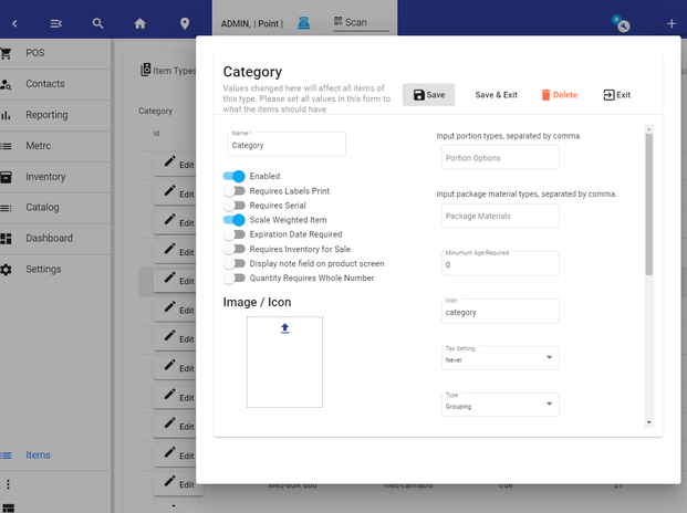
General Fields
| Field | Description |
|---|---|
| Name | Display name for the item type (required). |
| Type | The broader category group (e.g., Retail, Cannabis, Grocery, Tobacco, Discounts, Store Credit, Service Fee). Determines which additional fields appear in the editor. |
| Use Type | How the item functions in a transaction: Product (sellable item), Adjustment (discount, fee, gift card), Category (organizational grouping), Modifier (add-on to another item). |
| Icon | Material icon name displayed alongside the item type. |
| Image / Icon | Upload a custom image that appears as the item type's thumbnail in the grid. |
Behavior Toggles
These toggles control how items of this type behave during sales, inventory tracking, and display.
| Toggle | Description |
|---|---|
| Enabled | Whether the item type is active and available for use. |
| Requires Labels Print | Forces label printing when items of this type are sold or received. |
| Requires Serial | Requires a serial number entry for each unit. |
| Scale Weighted Item | Item is priced by weight using a connected scale. |
| Expiration Date Required | Requires an expiration date to be set on products of this type. |
| Sale Requires Inventory | Blocks the sale if inventory count reaches zero. |
| Sale Product Count > 0 | Requires a positive product count on the order line. |
| Display Note Field | Shows a free-text note field on the product screen at the register. |
| Quantity Requires Whole Number | Restricts quantity to whole numbers (no decimals/fractions). |
| Prompt Price | Prompts the cashier to enter or confirm the price at the register. |
| Prompt Quantity | Prompts the cashier to enter the quantity at the register. |
| Auto Nav to Credit | Automatically navigates to the credit/payment screen when this item is added. |
| Auto PreAuth | Triggers an automatic pre-authorization check when the item is added. |
| Disable Price Category | Hides the price category selection for items of this type. |
| Disable Simple Price | Hides the single price field; price must come from categories or tiers. |
| App Uses Default Price from Price Category | The customer-facing web app uses the default price from the item's price category. |
| Restaurant View for WebApp | Renders items of this type in a restaurant-style layout on the web storefront. |
| Exclude from Sales Report | Items of this type are excluded from standard sales reporting. |
| Rental Item | Treats the item as a rental with time-based rates. See Rental Booking Admin Setup for details. |
Dropdown Fields
| Field | Description |
|---|---|
| Tax Setting | Controls tax behavior: Never (never taxed), Taxable (always taxed), According To Transaction (tax follows the transaction's tax setting). |
| VAT Style Tax | Applies VAT-style tax calculation where tax is calculated as a portion of the total rather than added on top. |
| Matrix Type | For matrix/inventory-tracking items — determines how child items and variants are managed. |
| Prep Ticket | Assigns a receipt template used as a prep/kitchen ticket when the item is ordered. |
| Prep List | Assigns a prep list (side/preparation options) displayed at the register. |
| Prep Line Color | Color picker that sets the row color for prep/kitchen display lines. |
| Portion Options | Comma-separated list of portion types (e.g., "1oz, 2oz, 3.5oz"). Used as prompts at the register. |
| Package Materials | Comma-separated list of package material types for packaging tracking. |
| Minimum Age Required | Numeric age threshold enforced at sale time. |
| Unit Type (UOM) | Unit of Measure label (e.g., "each", "oz", "lb"). |
Next to the Unit Type field there is a Set Child Items UOM button. Clicking it (after confirming) sets the UOM on every product of this item type to match the item type's UOM, so all products of the type stay consistent.
Cannabis-Specific Fields
These fields appear only when the item type is set to Cannabis or Med-Cannabis.
| Field | Description |
|---|---|
| Package Type | The METRC package classification (e.g., Marijuana Weighed, Marijuana Packaged, Solid, Liquid, Extract, Seeds). |
| METRC Group | The METRC product group assigned to the type. |
| METRC Category | The specific METRC item category for regulatory tracking. |
Grocery / Retail Fields
| Field | Description |
|---|---|
| WIC & EBT Option | Flags the item for WIC and/or EBT eligibility. Available for Grocery and Retail types. Options: None, WIC, EBT, WIC and EBT. |
Shipping Dimensions
These fields appear when shipping is enabled for the item type.
| Field | Description |
|---|---|
| Ship Width | Package width for shipping calculations. |
| Ship Depth | Package depth for shipping calculations. |
| Ship Height | Package height for shipping calculations. |
| Ship Weight | Package weight for shipping calculations. |
Labeling
| Field | Description |
|---|---|
| Label Type | Select a label template (from configured ZPL labels) that prints for items of this type. |
| Inventory Exit Label | Separate label template used when inventory leaves the system. |
Auto Attach Products
You can configure products that automatically attach when an item of this type is added to an order. Use the product search selector to find and add "tagalong" items, displayed as removable chips below the search field.
Advanced JSON Fields
These fields are stored as structured data on the item type and control specialized behaviors:
| Field | Description |
|---|---|
| Sell By Value | Default "sell by" value for expiration tracking. |
| Use By Value | Default "use by" value for expiration tracking. |
| Item Name Prefix | Text prepended to the item's display name. |
| Item Name Suffix | Text appended to the item's display name. |
| Subscription Frequency | Recurrence interval for subscription-based items. |
| Subscription Retries | Number of retry attempts for failed subscription charges. |
Instructions
The Instructions field at the bottom of the editor is a rich-text area. Content entered here displays on printed labels and on the web storefront beneath the product, providing storage instructions, usage guidance, or regulatory information.
mKonnekt Manufacturer Flag
In the Toggles section of the Item Type Editor, you'll find an mKonnekt dropdown. Use this to flag tobacco and nicotine item types for manufacturer-funded discount lookups:
| Option | Description |
|---|---|
| Clear | No manufacturer flag — mKonnekt discounts will not apply to this item type. |
| Altria | Flag for Altria-branded products (Marlboro, Copenhagen, On!, etc.). |
| RJReynolds | Flag for RJ Reynolds-branded products. |
Items with an mKonnekt flag will be recognized by the discount engine when scanned or added to an order. See mKonnekt Tobacco Discounts for the full setup and usage guide.
Special Item Types
Certain item type names trigger built-in behavior in the system. Naming an item type one of the following values activates the associated functionality:
| Item Type Name | Behavior |
|---|---|
| Order Name | The name of the menu item chosen becomes the name of the order. |
| Table Name | The name of the menu item chosen is assigned as the order's table name. |
| Remove Service Fee | Removes any auto-applied service fee from the order when this item is added. |
| Remove Gratuity | Removes any auto-applied gratuity from the order when this item is added. |
| Gift Card | Enables the gift card issue dialog when the item is added to an order. Use type must be set to adjustment, type to store credit. See Gift Cards for the full workflow. |
| Rental | When the Rental Item toggle is enabled, the item is treated as a rental with time-based rates. See Rental Booking for setup. |
Pricing
There are many ways items can be priced in Pointless.
- Single Pricing
- Price Categories - Multiple selections of prices
- Automatically adjusted prices, by time, date, or day of the week (happy hour)
- Pricing Based on clients or client type
- Price Tiers - Grouping of Prices based on Weight / Quantity
Single Pricing
When you open the Product Editor, the single price is shown, and you can edit it. You can then test the item in a sale.
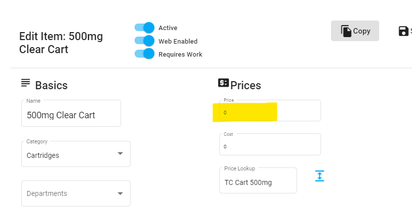
Single Pricing
Price Categories
Price categories are price groups associated with an item. They are not specific to any particular item but can be associated with many items.
Also, they are used when you want to have one item, with multiple sizes. Like 12oz, 16oz etc.
You will see a + symbol next to the price lookup if no category is selected. Or you will see an 'Open/Expand' icon if there is a category selected.
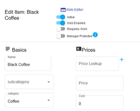
You would then press the + button and add in each zie you want to use with this. We'll enter three sizes for the coffee in this example.
*Make sure you enter the name of the price category, and then press save before entering sizes / prices for the category.
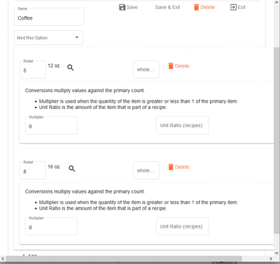
When you have entered the sizes and prices, you can verify the results by adding the item on the order.
Price Categories Edit
You can edit and add price categories. This submenu gives you access to the full-price category list.
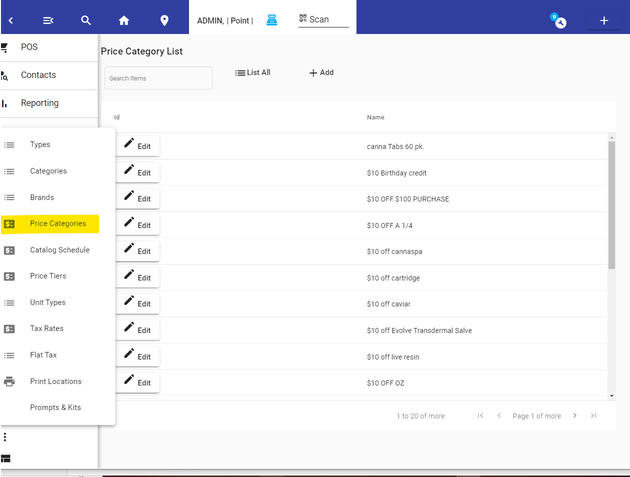
Price Category List
Price Categories Used to Change Inventory Sales Multiplication
Price categories have the added benefit of being able to affect the multiplier of inventory.
In some instances you can use the multiple selections of an item, to also indicate a different quantity being sold. For example, you can have a discount when buying 5 items, and use the price category to prompt the user to select 1 or 5, the inventory reduction will be five, but the sale quantity will show one.
Price Tiers
Price Tiers allow the user to sell an item without considering the price, yet having prices automatically adjusted for the quantity sold. They provide the additional benefit of providing a price when between a range of quantities.
When used with a scale, they can provide auto pricing very quickly for the cashier.
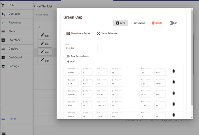
Price Tier List
Price Tier menu on Main Home Page
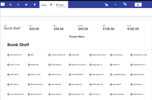
Price Menu Price Tier
Display Menus
Display Menus are customer-facing, browsable menus that can be shown directly at a URL or embedded inside a dashboard as a widget. They combine a visually styled banner, organized price schedules, and category navigation into a single navigable experience.
Creating and Configuring a Display Menu
Navigate to the Display Menu section from the admin product area. From here you can create new menus, edit existing ones, and manage their visibility.
Display Menu Admin Interface
The Display Menu editor uses a tabbed interface to organize settings into three sections:
| Tab | Icon | Contents |
|---|---|---|
| Features | tune | Menu properties: name, title, subtitle, toggles (Enabled, Staff Menu, User Menu, Side Panel Navigation, Disable in Handheld), logo and background image uploaders |
| CSS Styles | code | Free-form CSS textarea for custom styling the menu. Use the ID pos-fix-{menuId} to target this specific menu. |
| Menu Info | info | Rich-text editor (TipTap) for the menu description. This content appears on the customer-facing menu page below the banner. A hint reads: "These are displayed on the browser to help customers." |
The Save and Save & Exit buttons are disabled while an action (save, delete, copy) is in progress to prevent duplicate submissions.
Display Menu Properties
When editing a Display Menu, you'll find the following configuration options:
| Field | Description |
|---|---|
| Name | Internal name for identification |
| Title | Display title shown in the menu banner |
| Subtitle | Secondary text below the title |
| Description | Rich-text description shown below the banner |
| Background Color | Background color for the menu banner |
| Background Opacity | Opacity of the background image layer |
| Logo | Logo image displayed in the banner |
| Background Image | Banner background image |
Visibility Toggles
| Toggle | Description |
|---|---|
| Enabled | Whether the menu is active and accessible |
| Staff Menu | Show this menu to staff users |
| User Menu | Show this menu to customer-facing users |
| Show Side Panel Navigation | Enables a sticky side-panel that lists all price schedule categories. The currently visible category is highlighted as the user scrolls (scroll-spy). Tapping a category scrolls to that section. |
| Disable in Staff Handheld | Hides this menu from staff on phone-sized devices. Useful for keeping large-format customer menus off handheld POS units while still showing them on full-size terminals. |
Menu Content
The menu content is driven by Price Schedules. Each price schedule appears as a category section within the menu. Items within a schedule can include product images, descriptions, pricing, and per-guest party pricing (when guest count is set on the order).
Bilingual Item Labels
Products that have a Second Language value set in the product editor will display that text beneath the item name on customer-facing Display Menu screens. This allows bilingual digital menu boards without modifying the primary product name. Set the value in the Second Language field of the product editor form — it will appear on the display menu as soon as the product is part of an active price schedule.
Web Item Visibility
When viewing a Display Menu as a non-staff (customer-facing) user, only menu items that have their Web Product property set to Enabled will be displayed. Items not configured for web visibility are automatically hidden from customers. Staff users continue to see all items regardless of this setting.
Embedding in Dashboards
Display Menus can be embedded in dashboards using the Display Menu widget from the Menus palette. See Widgets → Display Menu Widget for details.
Chromeless Kiosk Mode
To open a Display Menu without surrounding app chrome (for kiosks or QR-code links), append hideNavigation=true to the URL:
http://yoursite.com/display-menu?id=1;hideNavigation=true
This hides the user header bar and presents only the menu content.
Menu View Overlay
When configuring a Display Menu through the admin Menu View, the following features apply:
Web-Only Filtering: When selecting departments or categories for a menu view, only departments and categories that have Web Product or Web Enabled toggled on will appear in the selection lists. This ensures only customer-facing items are available for menu configuration.
Function Filter Icons: Each filter function in the menu overlay displays an icon to help identify the filter type:
| Function | Icon |
|---|---|
| List Categories of Department | category |
| List Class of Department | label |
| List SubClass of Department | sell |
| List Styles of Department | palette |
| List Countries of Department | public |
| List Regions of Department | map |
| List Latest of Department | new_releases |
Latest Items as Tiles: When the filter function is set to List Latest of Department, items are displayed as tile cards with product thumbnail images. Each tile shows the product image and name, making it easy for customers to browse recent additions visually.
Image Carousel — Admin Save Behavior
When editing a price schedule that includes an Image Carousel, the carousel items are saved automatically when you switch between the admin tab panels or click Save. This ensures carousel content is never lost if you switch away before explicitly saving the carousel items.
WordPress Plugin Notation
When enabled by an admin, the product editor displays a visibility indicator at the top that tells you whether the product will appear in your WordPress storefront. This helps catch configuration issues before they result in products disappearing from the online store.
Enabling WordPress Plugin Notation
Navigate to Settings → Software & Hardware → Home Page Settings and enable WordPress Plugin Notation in Product Editor. You can also set an Inventory Threshold — when a product's inventory count falls at or below this value, it will trigger a visibility warning.
Visibility Status
Once enabled, each product editor shows one of two states:
| Status | Meaning |
|---|---|
| Visible in WordPress (green check) | The product meets all requirements and will appear in the WordPress storefront. If the product has groupProps, their count is shown. |
| Not visible in WordPress (warning) | The product fails one or more checks. The banner lists each reason. |
Visibility Requirements
For a product to be visible in WordPress, all of the following must be true:
| Check | Requirement |
|---|---|
| Inventory | Product count must exceed the configured WordPress Inventory Threshold |
| Barcode | The product must have a barcode assigned |
| Web Enabled | The product's Web Product setting must be enabled |
If any check fails, the warning banner lists each issue (e.g., "No barcode, Low inventory (2 ≤ 5), Web not enabled").
For inventory reconciliation and monitoring, see Inventory Reconciliation and Inventory Monitoring in the Inventory section.
To import a menu or product list from a photo, website, or supplier file instead of entering it manually, see Pointless MCP — Import Menu and Import Products.