Function Buttons
Function buttons allow you to assign particular sets of functions that might be special to your business type.
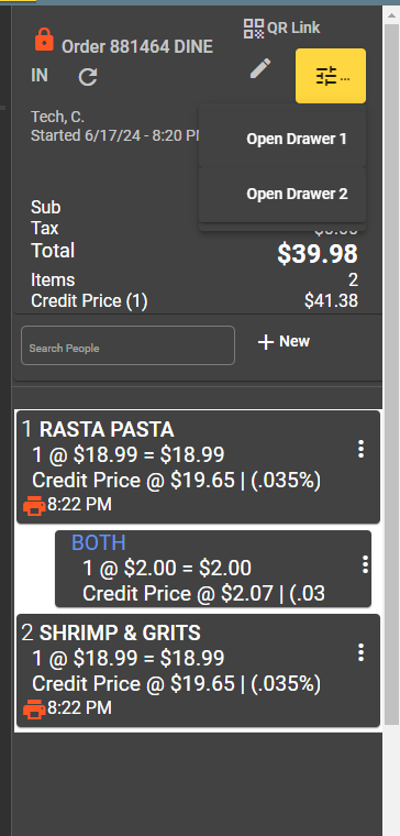
You can add function buttons to sections of your App from Transaction Settings. They will show up like this drop-down menu in the upper right corner:
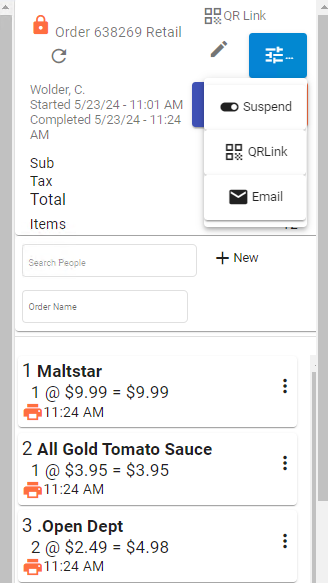
Custom Menu A
From Settings - Authorization And Access
You can add new menu groups, and then add new menu items to those groups. If you don't see a function you would like to use, let us know. You may refer to the Function List from the menu on the left.
Overview
Function groups are assigned to specific contexts using the Multi-Function Button Lists settings in Transaction Settings:
| Context | Setting | Description |
|---|---|---|
| Order Header | multiButtonOrderHeader | Buttons in the order screen header |
| Prep Header (Mobile) | multiButtonPrepHeader | Buttons in the mobile prep screen |
| Prep Header (Stationary) | multiButtonKPrepHeader | Buttons in the desktop prep screen |
Function Group List
The Function Group list displays all available groups for the current site in an AG-Grid table. Each row shows:
| Column | Description |
|---|---|
| Row | Row number |
| Edit | Button to open the group in the editor |
| Name | The group display name |
| Description | Optional description of the group |
Toolbar actions:
| Action | Description |
|---|---|
| Search | Filter groups by name (debounced input) |
| List All | Clear the search filter and show all groups |
| Refresh | Reload the group list from the server |
| Add | Create a new blank group (pre-populated with name "Input Name") |
| Reset Order Buttons | Creates a fresh "Order Buttons" group with the default set of buttons (Items, Suspend, Delete, Check Out / Pay, Labels, Re-Print Labels, Void, Leave, Order Details) and posts it to the server |
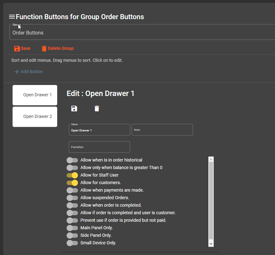
Function Group Editor
Clicking Edit on any group opens the function-group-edit screen, which provides a drag-and-drop interface for managing the buttons within a group.
Layout
The editor is divided into two panels:
- Left panel — A vertical, drag-and-drop list of all buttons in the group. Each button displays its icon and name. Buttons are re-ordered by dragging, and the new order is saved automatically.
- Right panel — Opens when you click a button in the left list. Shows all editable properties for that button.
Group-Level Actions
| Button | Description |
|---|---|
| Save | Saves the group's name and description |
| Delete Group | Prompts for confirmation, then deletes the entire group and navigates back to the list |
| Add Button | Creates a new blank button (name: "New Button") appended to the group |
Button Editor
Each button within a group is configured through two forms: the basic fields (name, icon) and the properties form (behavioral toggles stored as JSON).
Basic Button Fields
| Field | Type | Description |
|---|---|---|
| Name | Text | Display name for the button |
| Icon | Text | Material icon name (e.g., credit_card, delete, print). Click the icon picker button (right of the field) to browse and select from available icons |
Button Properties (Toggle Conditions)
Each button carries a set of boolean toggles stored in the properties JSON field. These toggles control when the button is enabled or visible in the POS interface.
| Property | Label in UI | Effect |
|---|---|---|
orderHistory | Allow when is in order historical | Button is active even when viewing historical (archived) orders |
balanceRemainingGreaterThanZero | Allow only when balance is greater Than 0 | Button is only enabled if the order still has an outstanding balance |
allowStaff | Allow for Staff User | Button is visible to staff (non-customer) accounts |
allowUser | Allow for customers | Button is visible to customer-facing accounts |
paymentsMade | Allow when payments are made | Button only appears after at least one payment has been applied to the order |
suspendedOrders | Allow suspended Orders | Button remains active for orders in a suspended (on-hold) state |
completedOrder | Allow when order is completed | Button is accessible after the order has been marked completed |
completedOrderAndUser | Allow if order is completed and user is customer | Button is accessible only when the order is completed AND the current user is a customer |
itemsPrinted | Prevent use if order is provided but not paid | Restricts the button when items have been printed (sent to kitchen/prep) but the order is unpaid |
mainPanelOnly | Main Panel Only | Button only renders in the main panel of the POS layout |
sidePanelOnly | Side Panel Only | Button only renders in the side panel of the POS layout |
smallDeviceOnly | Small Device Only | Button only renders on small-screen devices (e.g., tablets, phones) |
Function and Variable
In addition to the toggles, each button can be assigned a Function and an optional Variable:
| Field | Description |
|---|---|
Function (method) | The action the button triggers when clicked. Selected from a dropdown of all available functions. See the Function List for all available options. Stored in the method property of the JSON. |
| Variable | An optional parameter string passed to the function. Stored in the variable property. |
Default Order Buttons
The Reset Order Buttons action on the list view generates the following default button set:
| Name | Icon | method | Notes |
|---|---|---|---|
| Items | list | showItems() | Small device only |
| Suspend | — | removeSuspension() | Warn color |
| Delete | delete | deleteOrder() | Warn color |
| Check Out / Pay | credit_card | makePayment() | Side panel only |
| Labels | print | printLabels() | |
| Re-Print Labels | print | rePrintLabels() | |
| Void | delete | voidOrder() | Warn color |
| Leave | — | clearOrder() | Warn color |
| Order Details | — | getPOSOrderWithMenuItems() | Accent color |
All default buttons share these property defaults: balanceRemainingGreaterThanZero: true, allowUser: true, allowStaff: true, itemsPrinted: true, isAuthorized: true, suspendedOrders: true.
Function groups let you customize the toolbar experience for different roles and workflows without modifying code. Create separate groups for kitchen staff, front-of-house, and management as needed.